Outro Co.
Outro Co wanted an identity that suggested the influences of music within their name as well give the feeling of luxury.
This brand is for those who are tenacious, prosperous and focused.
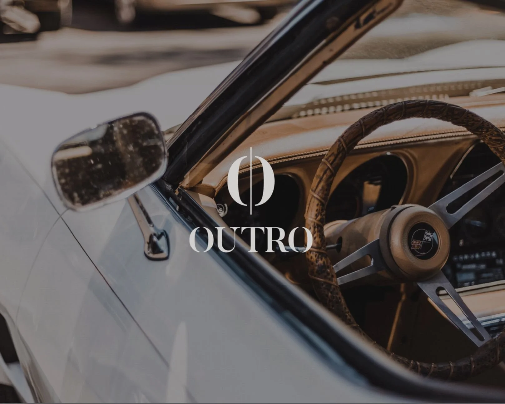
The Outro logo uses a classic serif font typeface as a base. From there, things get kicked up a notch with the introduction of a bar merging through the logo icon. This was inspired by musical notes and marks. This treatment is carried onto the O’s of the logo to bring harmony between the icon and logo typography.
Brand Identity
Art Direction
Design
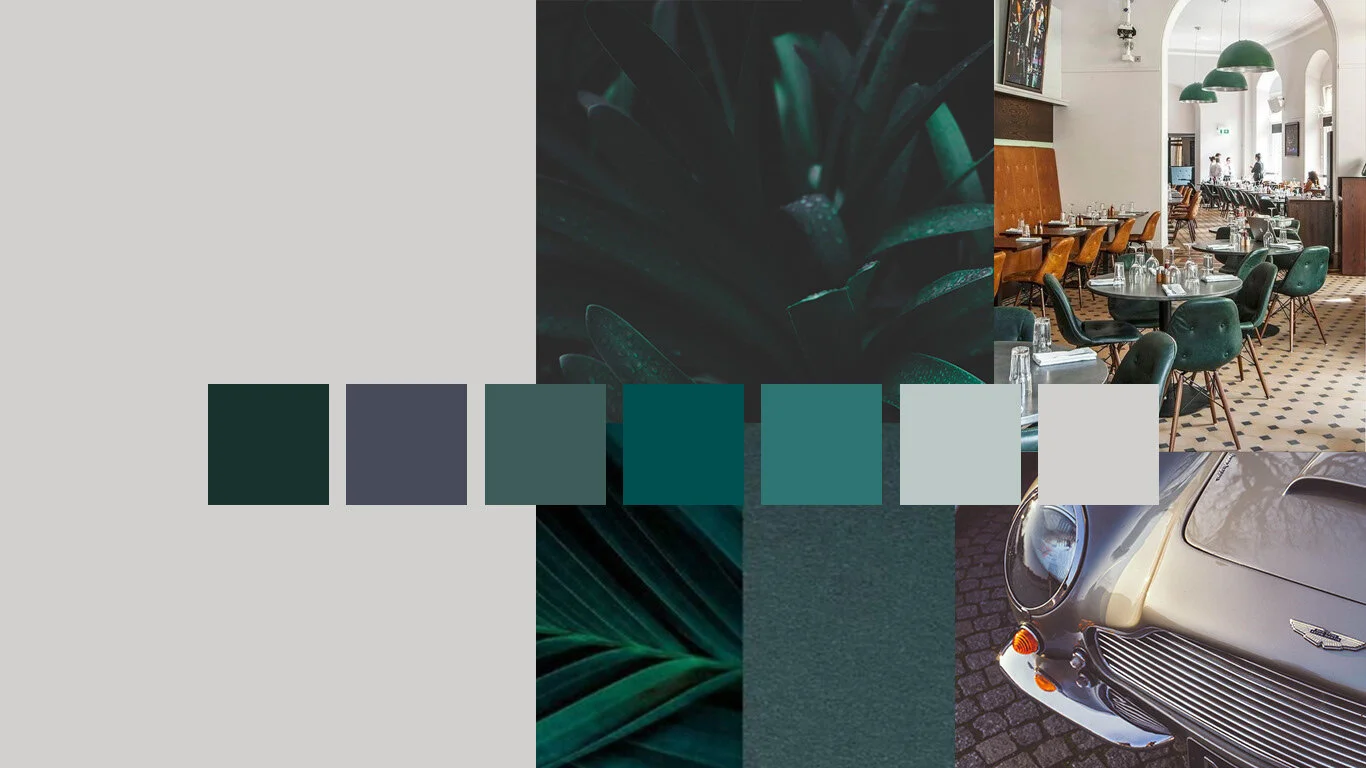
“The colors are rich but muted, the lighting is dramatic, the people are attractive yet unique."
